 RARE Technologies
19th August 2017
For last phase of my project, i’ll be adding a visualization which is an attempt to overcome some of the limitations of already available topic model visualizations. Current visualizations focus more on topics or topic-term relations leaving out the scope to comprehensively explore the document entity. I’d work on an interface which would allow us to interactively explore all the three entities which are associated with topic models: document, topic, word. I’d be using D3 for this visualization and it would be accessible in Jupyter notebook. HTML hook for notebook will be used to embed the javascript visualization.
12th August 2017
This week I worked on adding another visualization – topic networks (PR 1536). It could help us see the connections between topics and discover the clusters of similar topics.
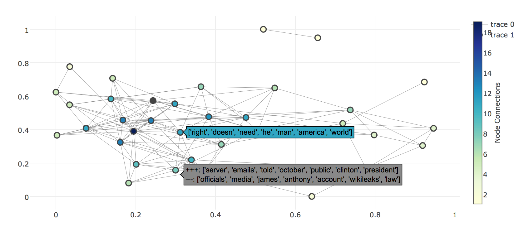
The jensen-shannon metric is used to draw the connections between nodes. Though other available distance metrics in gensim can also be used. The nodes display the topic id with it’s top words and the edges display the intersecting/different words of the two end nodes. Now, we need to define a threshold for drawing the edges such that the topic-pairs with distances above that does not connected. We could either experiment with few different values such that the graph doesn’t become too crowded or too sparse or we can also get an idea of threshold from the dendrogram (with ‘single’ linkage function). The y-values in the dendrogram represent the metric distances and if we choose a certain y-value then only those topics which are clustered below it would be connected.
2nd August 2017
PR-1484 is almost near it’s completion. It adds the dendrogram visualization which I talked about in last post. I added the additional parameter to define text annotations on the upper hierarchy levels also which could enable user to see the common/different terms on the cluster heads also which are made up of topics in leaves. It also adds the Jenson-Shannon metric which is symmetric as opposed to kullback-leibler. The reason behind adding this metric was that pyLDAvis uses this metric to calculate the inter-topic distances from which the topics plot on left panel is generated. And as I explained in earlier posts that we can see the exact distances between topics using the diff() plot in gensim, so adding this metric would let us see the distance matrix from which the pyLDAvis topic plot was generated.
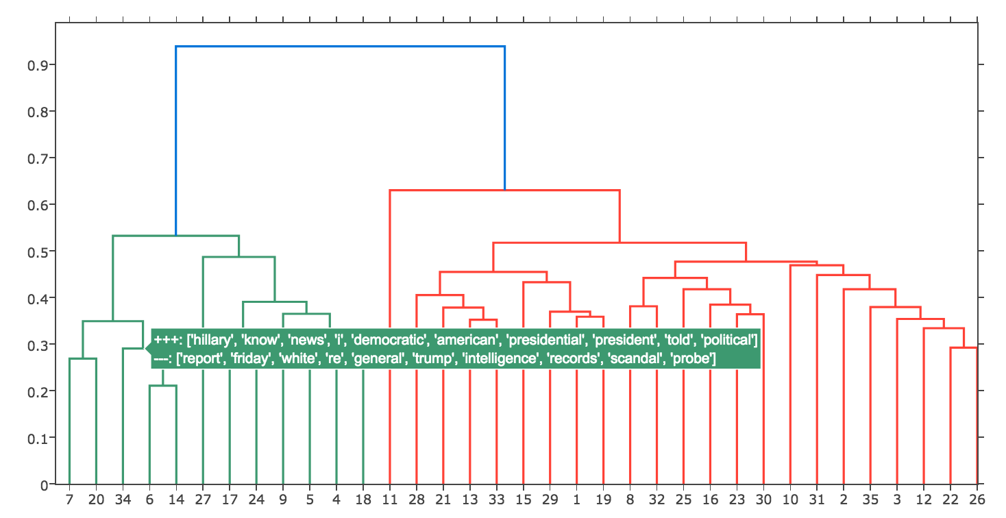
Topics dendrogram with text annotation
I have also addressed the reviews on PR-1448 and PR-1399 which would hopefully get merged by the next week.
19th July 2017
In previous blog, I explained how the distance matrix was used for topics projections on a 2d plane in pyLDAvis. The main take-away was that we can use 2d projection of pyLDAvis to recognize clusters of related topics and simultaneously use topic diff matrix in gensim to see the exact relation between topics.
So, the next question that arise is that can we combine both the things in a single visualization and hence avoid going back and forth between the two plots. A visualization in which we can see the clusters of related topics and at the same time see the exact intersection and distance between them. It turns out that yes we can. We can use dendrograms for clustering the topics and append them with the distance matrix heatmap.
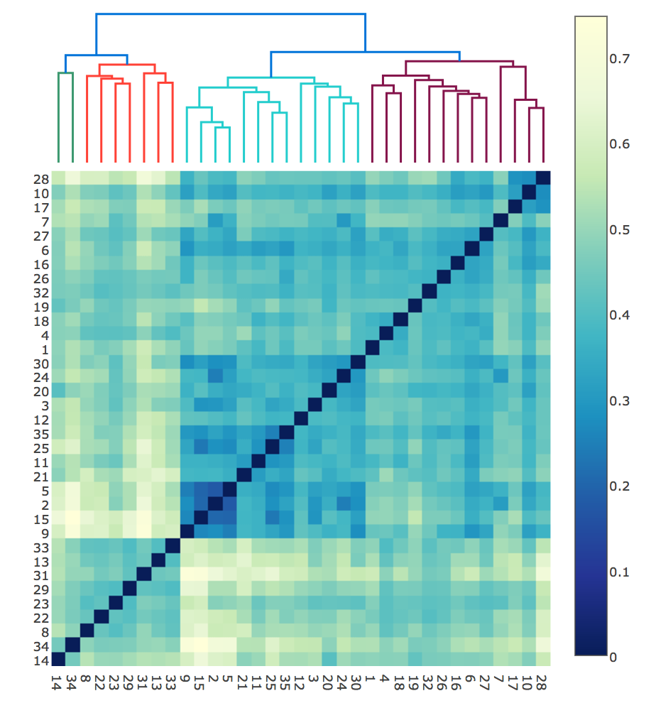
Dendrogram with heatmap for a topic model
The plot is created by first adding a dendrogram which clusters the topic. Then the rows and columns of the distance matrix heatmap are re-ordered to match the topic order at the lowest hierarchy of dendrograms. So now we can see the topics which are clustered together by hovering over leaves of dendrogram and simultaneously see the exact distance between any two topics by hovering over their heatmap cell which show the distance in z value and intersecting/different terms of the two topics in +++/—- values.
The visualization is complete so in the coming week I’ll add the notebook for it with interpretation and explanation of this visualization.
12th July 2017
Last weekend, Lev shared this notebook with me which was part of a talk that he attended in Pydata Berlin. It had a nice overview of popular visualizations available for topic models. So I dig deeper into them and got to learn a whole lot of new things about topic models and those visualizations. I’ve given a summarization of some important points below which I thought would be worth sharing.
LDAvis has two panels in its visualization in which the left panel presents a global view of the topics in a model and the right panel depicts the individual terms that are most useful for interpreting the currently selected topic on the left. I did discuss previously about the right panel’s barchart and term rankings in the “28th June” slot of this blog so today it will be more about the left panel.
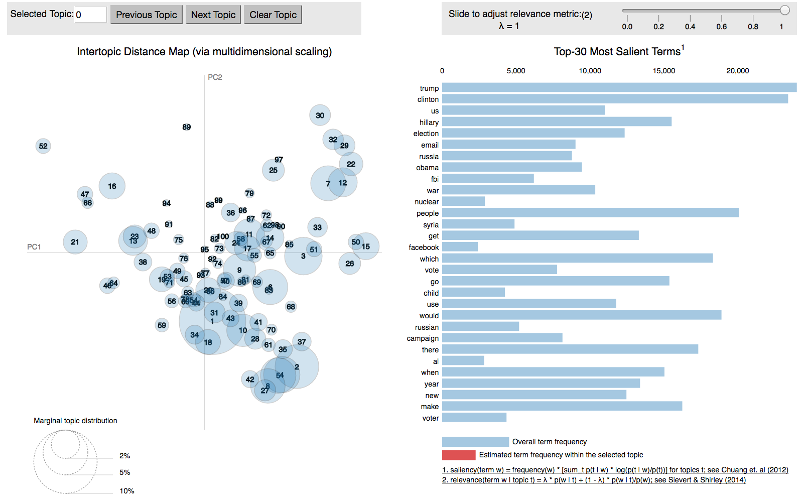
There are two visual features about the topic distance plot of left panel that provide the global perspective of the topics:
- The area of the circles is proportional to the prevalence of the topics in corpus. So, we can visually determine about the most important topics in our corpus. And the no. on the circles is also according to their size only, so we can simply compare the relative importance between the topics using the no. given to them.
- The topics (centre of the circle) are positioned according to their inter-topic distances. So, we can get an idea of how closely or distantly the topics are related. For this it first calculates the inter-topic distances using (default) Jensen-Shannon divergence and stores it in a distance matrix as illustrated below with a heatmap example.
 It then tries to infer the 2d coordinate for each topic based on the distance matrix. Principal coordinate analysis (PCoA) is used for this dimensionality reduction which seeks to preserve the original topic distances in 2d plane. It first converts the N-dimensional points in given metric’s space (default is jenson-shannon metric) into the euclidean space of same dimension and then simply do a PCA on these newly constructed points in euclidean space to bring them down to 2 dimensions. You can also refer to this blog for getting a graphical reasoning behind this technique.
Now while the positioning of the topics does preserves the semantic distances to an extent allowing some related topics to form clusters, it can be bit difficult to determine exactly how similar the topics are. For this purpose, we can go back to the diff matrix on which LDAvis applies PCoA to project it on a 2d plane. Gensim provides the heatmap implementation for visualizing these diff matrix and you can refer to this notebook with instructions on producing the heatmap.
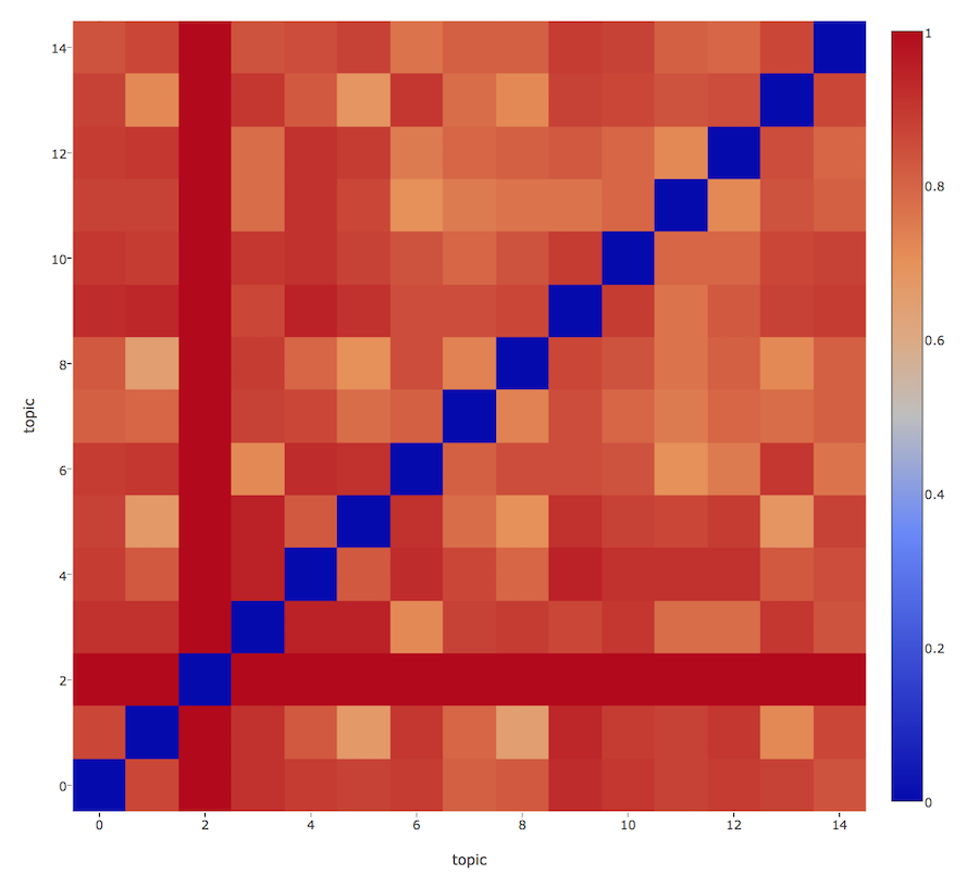
Topic difference in one model:
We can examine the exact distances between the topics which seems to be related in 2d projections of LDAvis using the topic diff heatmaps mentioned above. The x and y-axis define the topic numbers and z value shows the distance between them. It also shows the intersecting terms between two topics in the `+++` value, and non-intersecting or disjoint terms in `—` value.
Topic difference between two models:
Another plus point in using the topic diff heatmap is that we can compare the topic difference between two different models also, whereas the 2d projections used in LDAvis can only be used to see inter-topic distances in a single model.
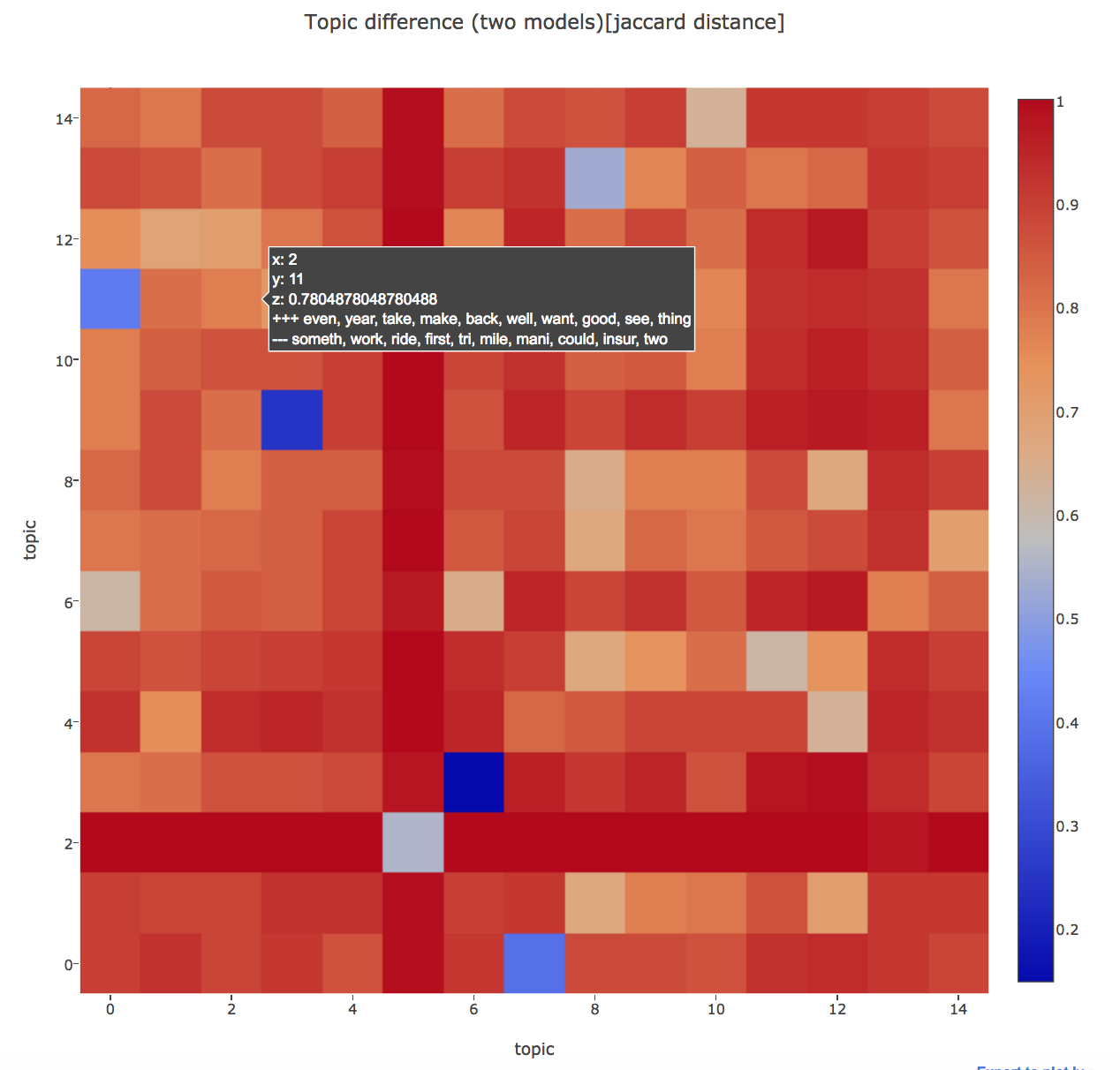
In case of comparing two models, the x-axis would define the topics from one model and y-axis would define the topics from another model.
Take away: So while the 2d projection of topics in LDAvis can be useful to recognize the topic clusters, we can parallely use the topic difference heatmap to verify the exact distance and their actual relatedness. Heatmap can also be used to compare the topics from two different models.
7th July 2017
This week I got a step ahead in solving the wordrank installation for docker container and the build was also successful (PR 1460). Next task was to add bool options for either returning the whole topic diff matrix or just the diagonal for optimizing performance in large LDA models (PR 1448). The rest of the week was spent around deciding and implementing a generic API design for training visualizations which could further be extended to other topic models available in gensim (PR 1399).
28th June 2017
The visualization for monitoring LDA training is almost near it’s end with just some API decisions left (PR 1399). This Notebook contains the explanation of parameters that are plotted for LDA as the training progresses. The graphs explained in the notebook aid the process of training by showing the live data from the LDA training and hence can help us know when our models are sufficiently trained. The model is said to be converged when the values stop changing with increasing epochs.
The docker image for gensim is also just one obstacle away from it’s completion (PR 1368). The wordrank tests are failing due to a configuration glitch in it’s dependencies installation. I’ll try to figure this out in the coming week and hopefully, this would be complete by next week.
For the next phase of my project, which is about visualizing the topic models for a deeper inspection of it’s entities ie. documents, topics and words, I’ve gone through the current visualizations available for ex. LDAvis, Termite, TMVE and documented the limitations or drawbacks in them. I worked on the rough sketch of a visualization to address the current issues and with the suggestions from my mentors, would be finalizing it within this week.
21st June 2017
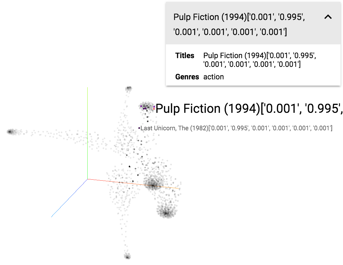
In previous week, I worked on visualizing the document-topic distribution in Tensorboard projector (PR1396) . It basically used the topic distribution of the document as it’s embedding vector and hence ends up forming clusters of documents belonging to same topics. Now, in order to understand and interpret about the theme of those topics, I used pyLDAvis to explore the terms that the topics consisted of.
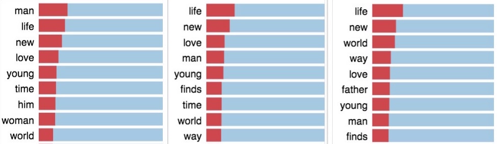
A topic in LDA is a multinomial distribution over the terms in the vocabulary of corpus which typically range in thousands. To interpret a topic, we can use a ranked list of the most probable terms in that topic. But, the problem with interpreting topics this way is that the common terms in the corpus often appear near the top of such lists for multiple topics, making it hard to differentiate between the meanings of these topics. For ex. lists below which are from different topics shows mostly similar terms, as the terms are solely ranked using their probability in the topic (using λ=1; λ explained later):
Hence, for a useful interpretation of topics, LDAvis uses a measure called relevance of a term to a topic that allows users to flexibly rank terms best suited for a meaningful topic interpretation. As (Sievert and Shirley 2014) explains, the relevance of term w to topic k given a weight parameter λ (where 0 < λ < 1) is: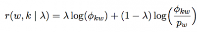 where φkw denote the probability of term w given topic t and pw denote the marginal probability of term w in the corpus.
In other words, the first part of equation ie. log(φkw) would basically depend on the frequency of a term in the topic which could be noisy sometimes due to common words which has high occurrence in every topic. The second part i.e. log(φkw/pw) can be viewed as the term’s exclusivity to a topic, which accounts for the degree to which it appears in that particular topic to the exclusion of others. The exclusivity measure generally decreases the rankings of globally frequent terms, but can again be noisy by giving high rankings to very rare terms that occur in only a single topic and hence the topics may remain difficult to interpret.
The weight parameter λ can be viewed as a knob to adjust the ranks of the terms from general occurrence to the exclusive occurrence to current topic. Setting λ=1 results in the familiar ranking of terms for large no. of topics, and setting λ=0 ranks terms solely based on their exclusiveness to current topic.
Now, gensim also has a method called `show_topic()` which returns the ranked list of terms in a topic with it’s probability of occurrence in that topic. For ex. list of (word, probability) for topic 1:
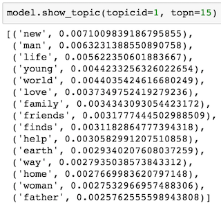
The question is how does gensim decide this ranking of terms in a topic and how it relates to LDAvis ranking scheme. In gensim, the float value given next to every term as shown in the list above is basically the φkw which was defined above and gensim simply ranks the topic terms according to this probability value. So, in order to have similar results as gensim’s `show_topic() in LDAvis, λ can be set to 1 which will then result in the relevance being directly proportional to only φkw.
13th June 2017
In the past week I mainly worked on 3 addition to gensim:
1. Visualizing LDA in Tensorboard (PR #1389). A Demo on a movie synopsis dataset can be seen here and the tutorial notebook here. I use the Document-topic distribution as embedding vector of a document. Basically, we treat topics as the dimensions and the value in each dimension represents the topic proportion of that topic in the document.
LDA visualization in Tensorboard
2. Adding the logging feature for two of the parameters in LDA, coherence and topic difference (PR #1381), which could help users in monitoring their LDA model training. Coherence is an evaluation measure for topics generated by topic modeling algorithms and topic diff shows the difference of topics between the consecutive epochs.
3. I’ve also started working on adding a visualization method for LDA training statistics and have used tensorboard till now. But, as I proceeded (PR #1399), I came to realize that tensorboard is a bit limited in Viz options and may not be sufficient for our use-case. So I started looking for possibilities of other Visualization frameworks which could fit our current case and can also be used for future visualizations in gensim. And Voila! I found Facebook Research’s visualization framework Visdom which was recently open-sourced. It has quite a good variety of available plots and is also extendable to the arbitrary Plotly visualizations as it relies on Plotly for the plotting front-end and has same API conventions.
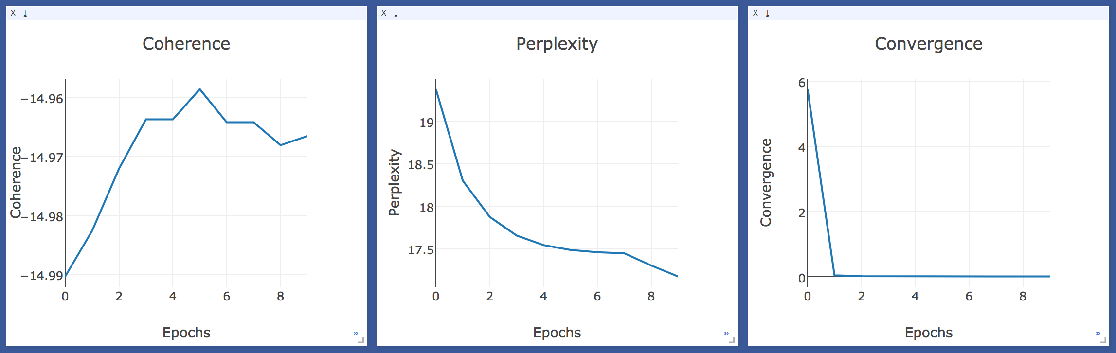
Monitoring LDA Training stats in Visdom
So, in the coming week, I’ll be working on finalizing the Visualization of training statistics in LDA and also wrap up the LDA log PRs.
31st May 2017. Community bonding.
Here’s my first post as part of Google Summer of Code 2017 with Gensim. This summer, I will be working on adding visualizations for topic models and training statistics in Gensim.
Contributing to Open source has always been a great learning experience for me. I got to understand so much about Software development workflows in the process of digging up the Open source project’s codebase to do my own additions or solve bugs. And then getting your code reviewed by the experienced project maintainers is yet another perk of open source contributions. They also comment about the best practices which helps polishing your coding skills even more with time. Hence, I am happy to have this opportunity in GSoC to work full time on open source.
Being interested in natural language processing and machine learning, Gensim was a perfect choice for me to apply for, in GSoC. I have previously worked for another NLP based project under RaRe’s Incubator program, in which I compared and analyzed different aspects of word embeddings. You can find a detailed blogpost about it here. My past contributions to gensim include these PRs which has helped me getting familiar with the Project’s workflow and codebase.
During the community bonding period, I started working on adding the docker container for gensim in PR-1386. This was actually the first time I came to know about docker and instantly realized what an amazing tool it was when I read about it. It is a pretty cool platform which let’s you wrap your application with it’s dependencies in a small, neat container. In a way, Docker is bit like a virtual machine. But unlike a virtual machine, rather than creating a whole virtual operating system, Docker container use the existing Linux kernel as the system it is running on. This significantly reduces the size of the application leaving behind the useless VM junk.
In following summers, I’ll be working on adding visualizations for gensim. This Visualization project is a very good opportunity for me to work on this crucial aspect of Data science and enhance my skills in the art of visualization. I also added a notebook previously about visualizing the document embeddings in Tensorboard, after I was done finalizing my gsoc proposal for gensim. You can see the Visualization demo here with already uploaded document embedding trained on a Movie synopsis dataset.
Document embedding visualization in Tensorboard
A big thanks to my mentors at Gensim for giving me this opportunity and to Google for organizing this awesome program every year.
