The Facets project by Google’s “People+AI Research Initiative” (PAIR) offers two open source visualization tools for data analytics – Facets Overview and Facets Dive. Today, we are going to look at Facets Dive and demonstrate how to use it for an interactive confusion matrix for a multiclass classification problem using Python, Pandas and Scikit-learn.
Setup
There are two distinct phases to using Facets Dive: creating an analysis, and then sharing it with other people. Today we’ll look at creating interactive display widgets, and leave the “sharing” part for the next post.
Facets Dive can be installed as a Jupyter notebook extension. Setting things up is straightforward – the Facets project page has pleasantly clear instructions.
Interactive example
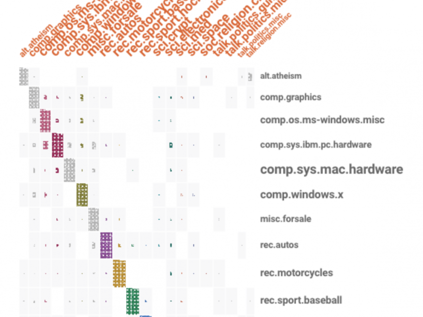
So, let’s see Facets Dive in action, on a simple machine learning experiment. We’ll build a multiclass classifier on 20newsgroups with scikit-learn, put all test set predictions into a Pandas dataframe, and finally display an interactive confusion matrix that lets you inspect each individual error:
If the Facets Dive widget above is too cramped on your monitor, click here to open it in a new full-width browser window.
The cool thing about this visualization is that it’s not a static image or screenshot! It’s fully interactive. Click on any individual data point (=one 20newsgroups email) inside the confusion matrix in the middle, and see the email details appear in the pink pane on the right.
This makes error analysis and sanity checking of the predictions a breeze. See those emails that were expected to be
Such visual insights make it clearer what steps are necessary to improve your classifier performance (here: better data cleanup, since the classifier was essentially correct, or even rethinking the task assumption that each email belongs to exactly one category, which is clearly violated in a number of cases).
You will probably note that only 8 (out of 20) labels are displayed in both rows and columns. The remaining 12 are grouped under “other”. This helps to keep the visualization uncluttered. On the other hand, the confusion matrix may get somewhat distorted. Facets Dive always displays the
Try dragging the blue sliders in the Faceting pane until it shows the full list of labels, so you see the complete confusion matrix. If the number of labels is reasonable (or your monitor large enough), this is the best way to display and inspect the model predictions.

The downside of showing a full set of labels is that the matrix may not fit on the screen. Here’s what it looks like in our case (showing only the top 12 facet rows).
Summary
Facets Dive is a simple yet powerful data visualization tool that will save you a lot of time analyzing errors in data experiments, or communicating your results to stakeholders — concretely and visually. The animated regrouping of data points when sliding parameters gets extra points during presentations. I have used it in several projects here in RARE and absolutely love it.
A Facets Dive widget can be easily embedded into any web page, as shown above. It can even be sent as a single-file attachment through email to your colleagues or boss. No Python or obscure dependency installations required! Such simple “deployment” and hassle-free sharing of results is a super practical, if often overlooked, feature and we’ll cover how to do it with Facets Dive in part 2 next week. EDIT: part 2 is here!
 RARE Technologies