 RARE Technologies
This blog post summarizes my work done during the Google Summer of Code 2017.
My task was to implement topic modeling visualizations which could help users to interactively analyze their topic models and get the best out of their data.
I worked on adding two types of visualizations:
1. To monitor the training process of LDA with the help of evaluation metrics available for topic models in gensim (Coherence, Perplexity, Topic diff and Convergence), as knowing about the progress and performance of a model, as we train them, could be very helpful in understanding it’s learning process and makes it easier to debug and optimize them. Earlier, the only way to track the topic model quality in gensim while training, was through the Perplexity values which were logged after mini-chunks update.
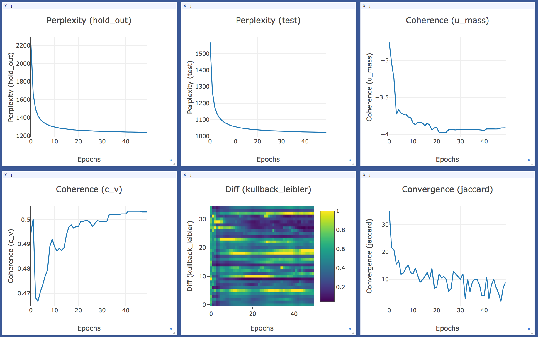
I added a visualization API in PR-1399 which plots the training statistics live in visdom browser. One can also log these stats or access them after the model is trained. You can find the tutorial notebook here.
2. To analyze the results of trained topic model applied to different applications. I added the following three visualizations in this direction:
- a) A tutorial for visualizing document clusters in Tensorboard. The topic distribution of a document is used as its vector embedding and dimensionality reductions techniques are then applied to reduce it to 2 or 3 dimensions.
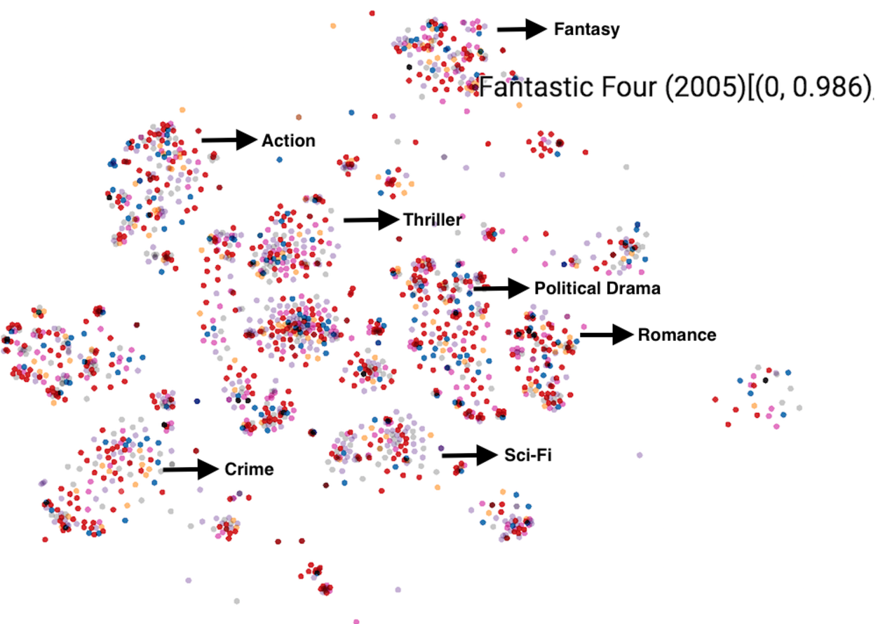
I added this in PR-1396 and you can find the tutorial notebook here.
- b) A visualization to see the clusters of related topics and at the same time see the exact intersection and distance between them. I used dendrograms for clustering the topics with extended distance matrix heatmap which could display the distance between every topic-pair.
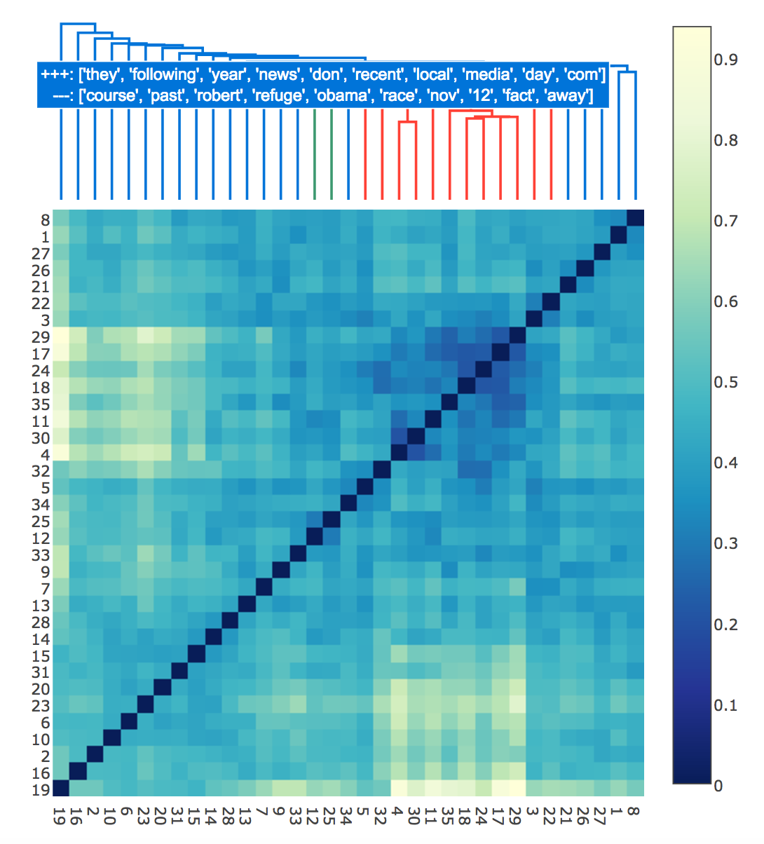
I added this in PR-1484 and you can find the tutorial notebook here.
- c) A topic model visualization using network graphs. Network graphs can be used to navigate that how topics belonging to one context may relate to some topics in other context and discover common factors between them. We can use them to find communities of similar topics and pinpoint the most influential topic that has large no. of connections or perform any number of other workflows designed for network analysis.
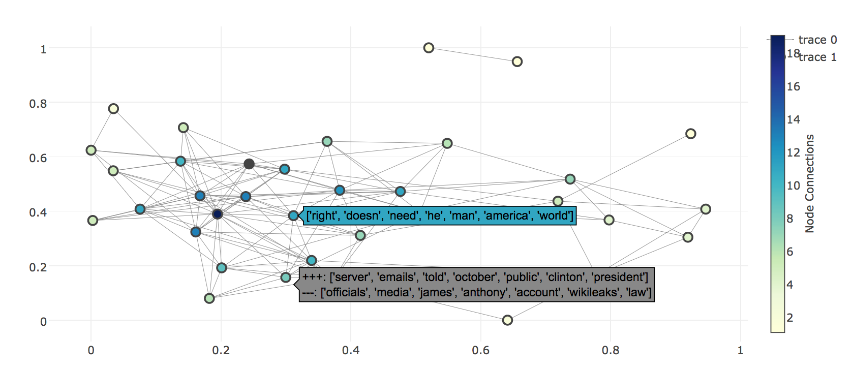
I added this in PR-1536 and you can find the tutorial notebook here.
I also worked on adding the dockerfile for gensim in PR-1368, which contains all it’s dependencies and additional packages for which gensim has python wrappers.
I have regularly blogged about my work on RaRe technologies blog where you can read my regularly updated live blog.
I’ve planned to work on another visualization in future which is an attempt to overcome some of the limitations of popular topic model visualizations like pyLDAvis, Termite etc. Current visualizations focus more on topics or topic-term relations leaving out the scope to comprehensively explore the document entity. I’d work on an interface which would allow users to interactively explore all the three entities which are associated with topic models: document, topic, word.
